Fairytale story… hemm I always listen to them when I was small. Not exectly listen, my parents dun tell me fairytales. I normally watch videos of it. I rewatch most of them many times, Cinderella, Snow White, Sleeping Beauty… and the list goes on and on. I always wish there were some fairy beside me to help me and guide me at times. So yeah… it’s time to show the world there is some magical and miracle to believe in. Me and my little fairei. As a little girl, I always wish I was a fairy. Got wings and fly around… got magic wand all. Small small size and can fly everywhere. Hehe…. I finally have the chance to draw my own fairy! Simple but cute. Oh it’s so magical!
Takeru submitted his artwork, koyuki-chan. I asked him why koyuki… he says it’s just a name. But it also means light snow. Ah.. a small, cute and as light as snow fairy! How adorable! Kawaii-neh!
*added on 25 August 2006* Heheh… Brian is late.. but well, he still manage to pull it all together and send us his Fairy-sheep. Very butterfly like fairy in the pastel like background. Totally makes everything seems so magical!
What is up next week? Anyone and everyone is welcome to join. Be it good or bad… it’s just something we do for fun! Generate some cool ideas and well.. surely fill up some of our boring times 😀
|
Project Crossroad

Looks like the recent Tom Cruise movie has awaken the mummies mode in us.
The mummies were wrapped in rolls and rolls of bandage and during Halloween, rolls of tissue paper were used in wrapping themselves up.
We recently had this team building activity where we needed to wrap ourselves up.
Some were obviously good at it, while some mummies are showing way too much skin.
As such, I was inspired to create this theme.
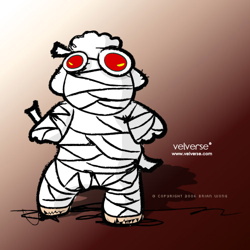
Brian’s sheep has turned in to shummy this week.
Sheep totally wrapped up with rolls and rolls of bandage.
His sheep mummy looks well wrapped and I would award him the best mummy wrapper as shummy still looks totally cute and adorable despite being wrapped fully.
By the way Brian, would you ever consider to print these on tees?
I want I want!
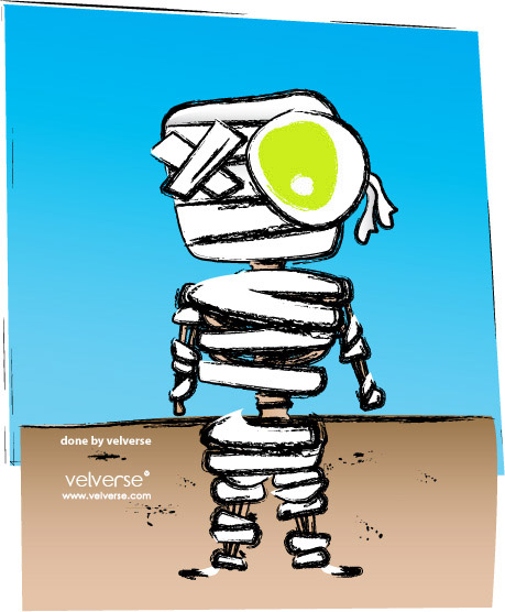
My version of mummy somehow was too busy dieting.
Only bones were left behind and an eye popping out.
The message of the artwork? Please eat more and stop dieting.
Most of the time, my characters love to show off their belly but in this case, it seems that they could only show their bone belly.
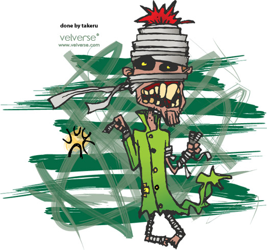
Takeru finally submit his artwork on time.
At one go, he submitted all the artwork for this week and from last week theme.
So let us start with his version of mummy.
He said he was angry when he was drawing it.
It was no wonder one can feel the anger and stress of the mummy but it still manage to do a peace ✌ sign.
What is up next week?
Project theme: Fairy
Project description: A more fantasy and dreamy theme. I love fairies as they are often associated with magical powers and elegance. So, calling all magical people, please do your magic.
Project deadline: 23 August 2006, Wednesday.
Anyone else interested to join, email your artwork to me.
Don’t be shy, let us all share our ideas and so something fun.

Inspired by the movie Lady In The Water, we decided to draw we all have heard of, read of and even watched on TV over and over when we were kids.
Yes, that’s right. You’ve got it right – the mermaid.
It is said to be a half human half fish.
I have not seen one in my lifetime before but there are some to claim they have and it’s true.
And I think the closest thing that are similar to a mermaid is the Merlion, an iconic symbol of Singapore.
A Merlion is a mythical creature with a lion’s head and the body of a fish.
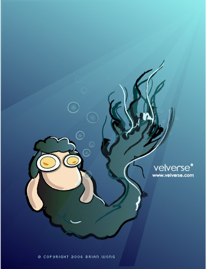
If Singapore has a Merlion, Brian had his own version – Mersheep.
I love the colour tone. The calming and mystical blue gives the illustration a calming feel.
The Mersheep also had a fighting fish vibe which has a long and flowing tail.
The eyes of the Mersheep looks like two fried eggs, which gives it a humorous touch.
While it was always said that mermaids don’t eat fish cause they don’t eat their own kind.
But my version of mermaid is totally different.
She loves to eat seafood and fish 🍣. It’s just like Azli, our ikan (fish) that eats fish 🐠.
Haha , that’s right. Seafood is just too yummy.
And I love this seaweed hairstyle. Who needs hair when you can have seaweed hair.
So green, so IN!
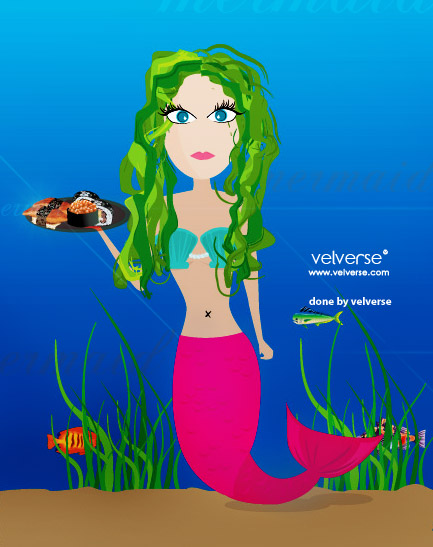
As always, Takeru is fashionably late with his mermaid work.
He submitted his “Oh So Kissable” mermaid.
Takeru is always known for his bold colour choice.
This time, a yellowish gold theme.
From gold hair to scales, so bling, so precious.
A beautiful gem indeed.

What is up next week?
Project theme: Mummy
Project description: From the sea we travel to Egypt. Let’s dive into the world of mummies. Now let me stock up on some bandage.
Project deadline: 16 August 2006, Wednesday.
Anyone else interested to join, email your artwork to me.
Don’t be shy, let us all share our ideas and so something fun.

Every time I heard of the word Tiki it makes me laugh.
I am not sure why, the feeling just appear every time I heard it.
So I decided to use it as the theme for the week, but I think it must be a hard subject since we are only down to 2 submission.
Don’t worry, the show must go on, so I will still showcase what was submitted.
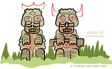
Brian didn’t fail to amaze me. Instead of a solo tiki, he submitted a couple tiki.
Hmm.. maybe not a couple but it comes in pairs.
It was his sheep troop praying to their sheep tiki called stiki.
I think it was cute especially the one on the right side that looks a little more bull looking.
Nice work! And look forward for more sheep.
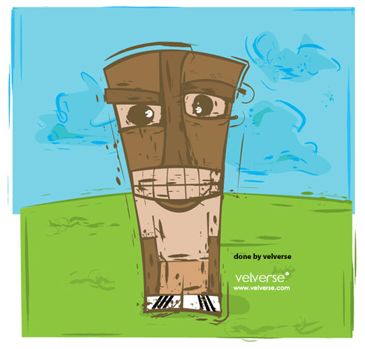
I have also submitted a tiki doll that loves a good casual tee and a pair of white adidas shoe.
Finally, something more grunge and messy.
Right, talk about modernism!
Edited on 2nd August 2006
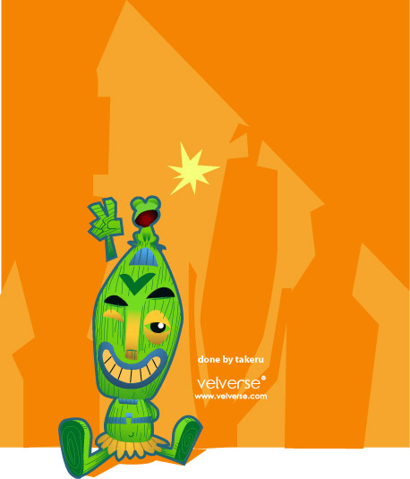
Takeru submitted a very cute tiki, whereby he named it tikitake.
I totally fell in love with the colour combination.
The orange background with bright green tiki.
The little frog sitting on top of the character adds mood and cuteness to the character.
I especially love the wood grain texture that Takeru adds in.
Love, love love it. Para salute to him!
What is up next week?
Project theme: Mermaid
Project description: The lady in the water is making its ways to us. Everyone wants to see it, wants to know about it and we will draw about it.
Project deadline: 8 August 2006, Tuesday.
Anyone else interested to join, email your artwork to me.
Don’t be shy, let us all share our ideas and so something fun.

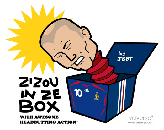
Doink… and out comes jack in the box. I always think it was scary. As a kid or even now. I still don’t understand how people could think clown that hides in a box as cute, funny and nice. I just finds it scary. Probably it has been overused in scary or horror movies back in the 80’s. But then anyhow, let’s see our own jack in the box. Jaebot is back. This time around he have this cool ZiZou in Ze Box. With the current hot headbutting issue. I just love how he put and fully use the issue and put in nicely in to the topic. Brilliant and totally cool! But I still support you ZiZou. Headbutt man.. headbutt!
Takeru’s jack in the box is currently Jack Out To Lunch Box. Hahaha… Just so cute, we needs a break, Jack needs a break too. Guess Jack will be back when Jack is done with lunch.
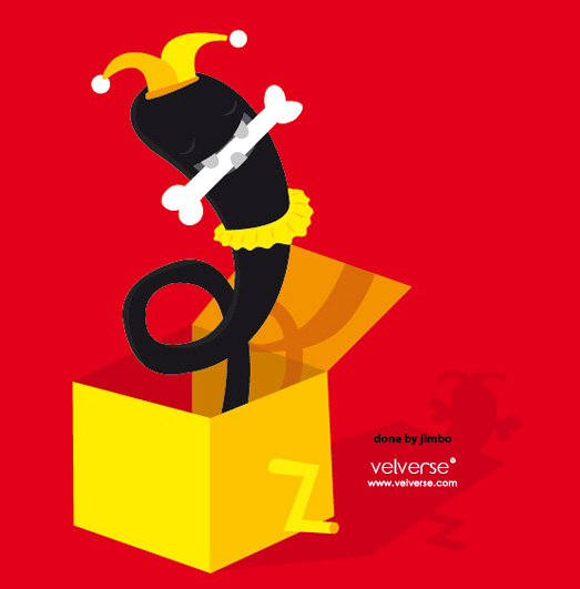
Jimbo is awaken again. This time, a new cutie character. A totally bone lover. Constantly biting a bone and imagine that jumping out of the box. Totally love the colour play and I still want the tee!
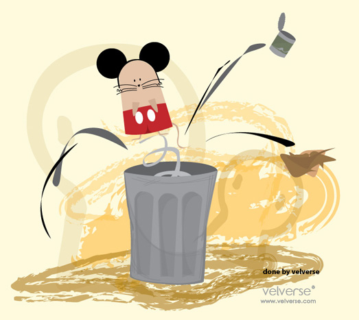
I manage to submit my Meekey in the bin. Hehehe… I just tot it would be run to do a cute and cuddly mouse jumping out form a bin. Yeah… a Mickey wannabe. Everybody love Mickey! So yeah, pay some attention to Meekey too okay!
Right… miss Brian’s sheeps in action? Yeah.. he is sorta busy for the day and well… I’ll just add in tomorrow. So stay tune!
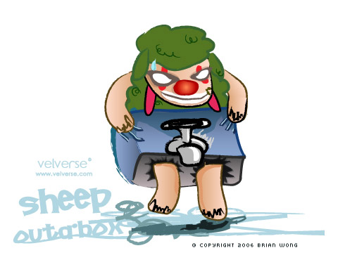
*added on July 26th* Yeay Brian finally manage to submit his Sheep Outabox. Due to the late submission, I guess his sheepo sorta do the Flinstone’s style and runs here quickly. As scary as it can be, it finally set foot in our Crossroad submission. Bravo! What is up next week? Anyone and everyone is welcome to join. Be it good or bad… it’s just something we do for fun! Generate some cool ideas and well.. surely fill up some of our boring times 😀
|

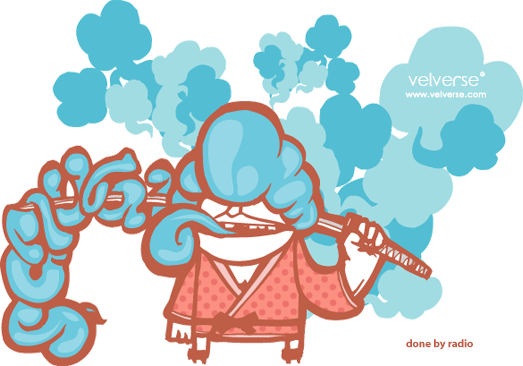
Wee…. samurai *chop chop chop*. The furious, the masters of sword. Everyone somehow known the samurais for their great sword fighting. The long and sharp sword. This week, we hereby honour our fellow samurais by ilustrating our version of little samurai. Radio, a friend of takeru emailed me a cool yet funky samurai. I totally love the colour play witht he funky colour. Not to even mention there is a hidden word in the illustration. Hehe… I found the word dy… so did you find the word?
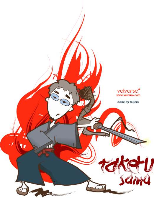
Takeru just keep making me say wow from week to week with his cool illustrations. This week he submited his Takeru Samu which literally means Master Takeru. Right… I gotta bow to the master for his skillful illustration skills. Totally love the red background!
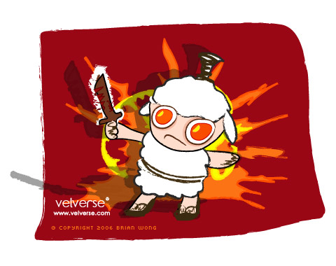
Brian submited his cute little sheep samurai. Hehe…. with two egg look-a-like eyes and hehe kiddo samurai sword, the little sheep look just so stunning and adorable. Samurai Kick! Way to go man!
I also manage to submit my own version of samurai. With the touches of chinese caligraphy mixed with some western style. I can’t help to use some of the rough brush edges lines ad I notice it give a more asian feel to the illustration.
What is up next week? Anyone and everyone is welcome to join. Be it good or bad… it’s just something we do for fun! Generate some cool ideas and well.. surely fill up some of our boring times 😀
|

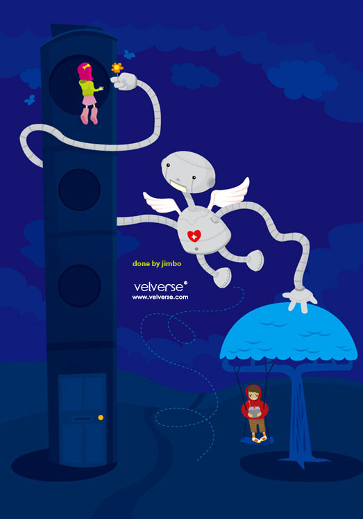
Steel, cold hearted, emotionless. That are the constant words used to describe robots. Everyone thinks that way. I think that way too. How can a robot take over the world and take over human. It’s just so not possible. But then again, impossible is nothing. This week, I decided to go for the Robotica theme. Right, since some is bored with animals and what not. So yes, I proudly present you with Robotica. I sorta think this weeks title is a little too difficult for many as… ahhahaa… I’ve some messages and all thinking it was rather challenging and hahaha the number of submissions just lessen. Jimbo bombard me with a bluish image right… with a very emotional and heart-felt robot. Ah… so cute and lovely robot named bobot. I think the robot looks kinda cute reminding me of rappunzel (lets hope I get the name rite). Ermmm just that now she doesn’t have to let down her hair. 😀 Just so cool.
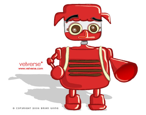
Brian did up this sheepotic. Hehehe… I somehow felt it looks more like a red penguin. But well.. the retro feel with the redness, does makes it look cute.
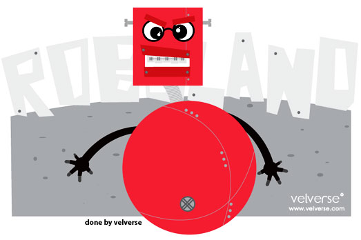
Me and my dumberbot. My cute little robot that rolls around.. right… to fat to walk. Rolls around Roboland. With it’s braces and screws on the lose.. well.. right.. it’s not some smart robot. It’s dumber than dumb robot. But well, he is cute and aggressive robot. Grrrrr…. beware~
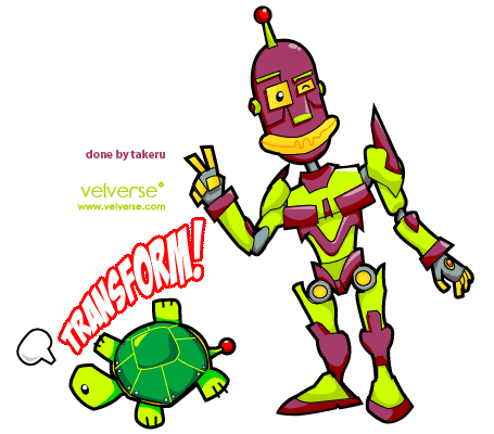
Takeru hehehe… handing in late homework this time manage to submit us with one of his own transformer version of robot. Right…. no other than his takebot. How cute, it eventually transform in to a tortoise. Haha… I guess he has special interest with tortoise.
What is up next week? Anyone and everyone is welcome to join. Be it good or bad… it’s just something we do for fun! Generate some cool ideas and well.. surely fill up some of our boring times 😀
|

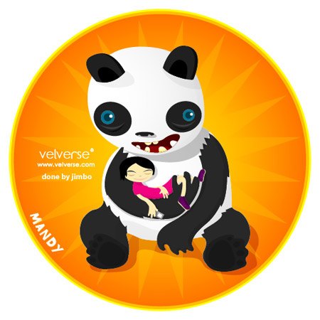
I need care… I want to care.. I feel like caring. To care even more, we even have a bunch of care-animals… to show care and appriciate art and us. I still remember when I was a little girl, I would always sit in front of the television and wait to see carebears. Now… we all have a group of care-animals. Each one special… each one unique… each one different. Jimbo did something very cute for me… awwww so lovely. He did a Guardian Panda name MandyPandy. Hehehe.. so cute… right, I like panda and pinky and purple. Hehe… The best part, the little girl is holding something that I always hold in hand 🙂 What is it? You must guess.
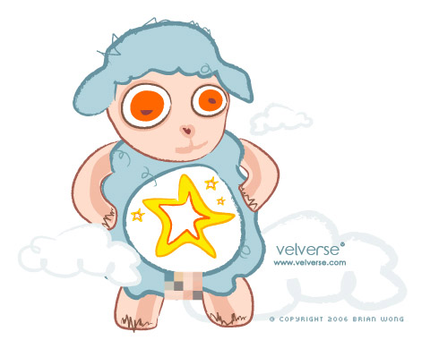
Brian is ever famous for his sheep character. Every week a different sheep, a different purpose, a different feel. This time around, his little sheepo is here to care for us, Care Sheep. Hehehe… his sheepo has special powers which is Starburst. Erm… according to brian… the sheep actually give hopes to children. Yes, make a wish and send it to the stars.
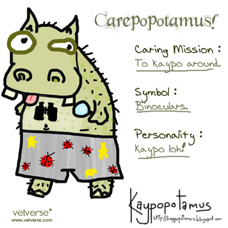
Jenhan decided to join our care family this time round and present us with his Carepopotamus. A lovely but kaypo hippopotamus. He has this special binoculars and well… surely is used to peek and kaypo around. Ah… just like his personality always does.
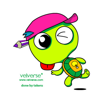
Takeru and his care kura-kura, has a mission. To show people how to be creative. The bulb represents idea. Yes, his special powers… spread ideas around, and let’s be creative. A cute tortoise that manages to get along with people. Yes, I hope everyone is touched by his powers. Haha~ 😀
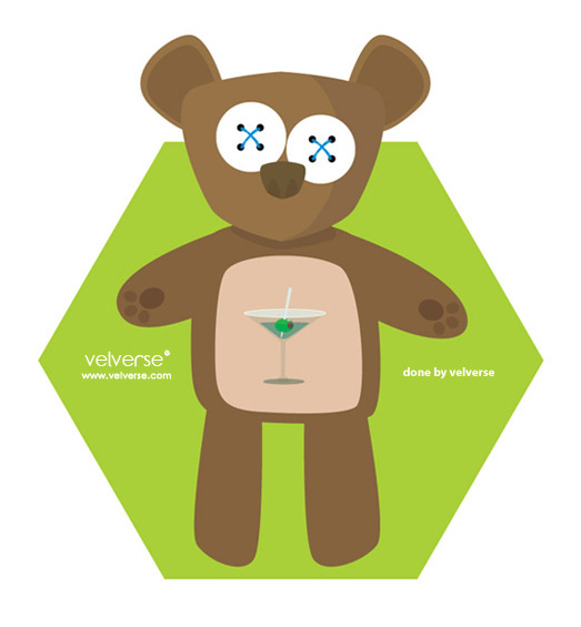
I make up a version of my own care bears. I have my CareTeddyBear. As cute and cuddly as it is, it posses a powerful power. Hehe… alcohol… true, everybody needs to drink and relax once in a while. Best occassion for CareTeddyBear to show up.. parties!!! Hehehe… cheer babe! Cheers! Martini anyone?
What is up next week? Anyone and everyone is welcome to join. Be it good or bad… it’s just something we do for fun! Generate some cool ideas and well.. surely fill up some of our boring times 😀
|

From football to monsters, that is quite a big leap in terms of project theme.
I always think monsters are creepy until I saw Monster’s Inc.
It totally blow my mind away !
I was reminded of the monsters as I saw movie clips of Monster’s Inc. when I was watching the Cars.
So here I am, celebrating the a new celebration – Monster’s Day.
On this day, I present you with our own version of monsters.
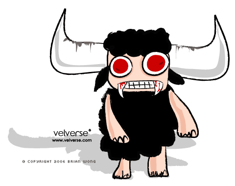
Brian was the first to submit his Monster Sheep .
As cute and as monster as it can be, he totally eats the theme.
I totally love the big horns and bloody red eyes.
Ever consider turning it into a plush toy?
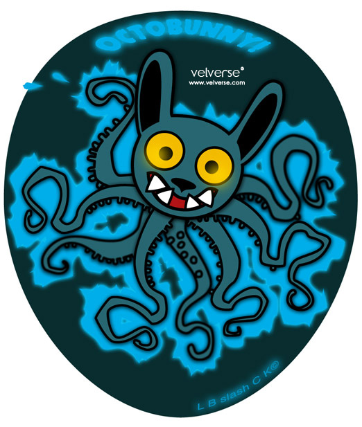
L B is quick to shock us with his Octobunny!
It surely looks electrifying but at a glance, it does look a little like an Octobat to me.
The Octobunny surely will do the trick in scaring little kids especially when they are about to eat octopus or squids!
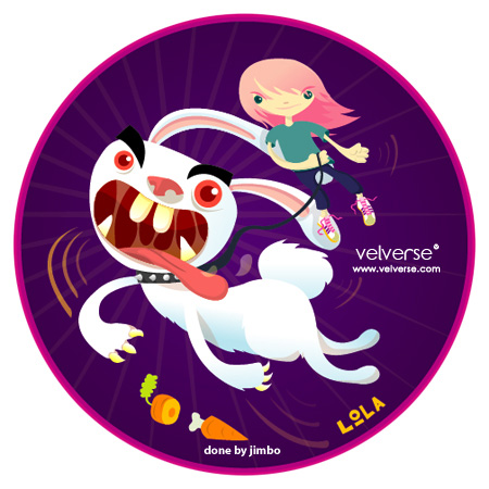
Jimbo submitted yet another bunny monster.
He presented us with his cool Lola Bunny.
Cute yet madly angry bunny.
Now it got me wondering if bunnies were that scary in real life.
Seems quite a number of bunny monster is submitted.
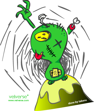
Takeru also joined in the fun with his takerumon.
Together, they both will take over takeruworld !
Takerumon had cute plaster on his belly button and nailed his head.
Looks so totally cute yet invasive.
Takeru, can you draw me a mandymon too?
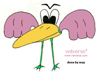
May came back from Beijing, just in time to submit her Duckoora.
I am quite certain that is was inspired by Peking Duck .
No meat, no crispy skin left. Just tje beak and showgirl feathers and gangreen (gangrene, get it?) legs.
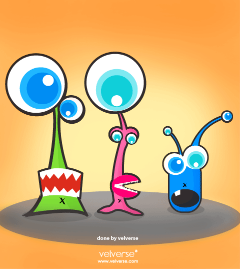
My version of monster was too harmonious and in fact they came in a family.
Mini, Miney and Mo.
They are a family of monsters that have the cutest eyes .
They just love to stare weirdly at people while they were snoring and dreaming.
What is up next week?
Project theme: Careanimals (our own version of Carebears)
Project description: We are inspired by our childhood cartoon – Carebears. If you are an 80’s baby, you will know and would have seen it at least once. So please submit your version of careanimals and tell me what magical things can they do.
Project deadline: 4 July 2006, Tuesday.
Submit to: mandy@velverse.com
Anyone and everyone is welcome to join. Be it good or bad… it’s just something we do for fun! Generate some cool ideas and well.. surely fill up some of our boring times 😀

Click on the banner go link to the project crossroad gallery.

The football ⚽ fever is all time high this season.
Everyone I know is either busy screaming or shouting with excitement or are total disappointed over the match progress.
As for me, I am totally excited as South Korea is still going strong and have yet to disappoint me!
Go go go! And Nicole just taught me how to cheer for the South Korea team.
She mentioned I should shout “tae han min guk!”.
As such, this week we decided to pay tribute and give our own take to the 2010 World Cup Mascot.
So let’s get the ball rolling!
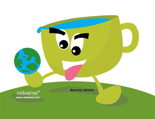
I manage to come out with cuppie, the next world cup mascot.
I personally am not sure what this year’s mascot name was and I always wonder how does one come up with the name World Cup.
Now, let’s carefully travel around the world with football without spilling anything!
LB submitted his version of the mascot named PussyGalore.
Haha, the cute big round eyes of the pussy gives it an additional cute points.
And the pink looking long and slim legs elevate its elegance.
But I still wonder it is named PussyGalore? 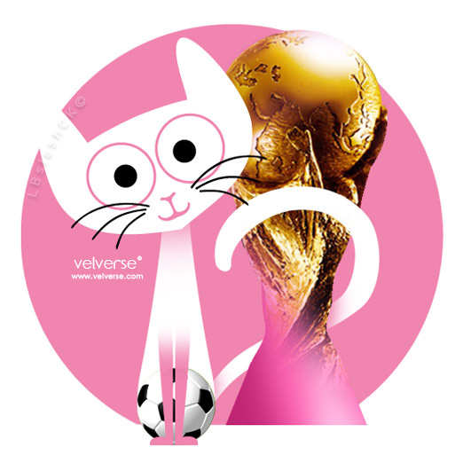
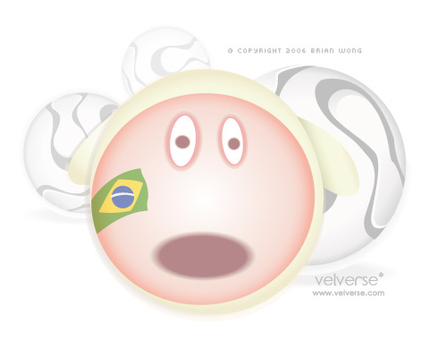
Brian also submitted his version of a cute sheep mascot for the next World Cup.
It is obvious he is a fan of the Brazil team from the flag face paint.
Takeru finally submitted something this week after his busy and hectic schedules for the last few week.
His mascot is named Chiyo. And why he choose Chiyo as the mascot?
That is because girls also starts to be more active in playing football nowadays.
Chiyo is actually a Japanese school girl that plays football.
So cute, the pure white long socks actually makes it so relatable.

Everyone else was too busy for this World Cup there, so this is all the submission I’ve received.
Let’s hope they will be less busy next week 😍
What is up next week?
Project theme: Monster Day
Project description: Monster is all around us. In the closet, underneath our bed or at a corner of a creepy place. Next week, we pay our deepest respect to the monsters.
Project deadline: 27 June 2006, Tuesday.
Submit to: mandy@velverse.com
Anyone else interested to join, email your artwork to me by Monday.
Be it good or bad, it’s just something we do for fun!
Let’s generate some cool ideas together and fill up some of our empty boring time


